


MASCHINE DINAMO is available to buy now – but not for long. Get it exclusively in our online shop while supplies last.

Type has always been important here at NI. “We’re not big fans of icons,” explains Johannes Schroth, the hardware designer behind our side of the MASCHINE Mk3 Dinamo collaboration. “I’m not sure it was a conscious decision, but we’ve always tended towards descriptive typography, even when mocking something up.”
For Schroth, type is one of several “dark arts” at the core of the NI product experience. It serves a clear signposting function, of course, helping music makers to understand how they might interact with a particular tool, but it also contributes to that tool’s character. “There’s a subconscious element,” he explains. “You can’t necessarily point your finger at it, but it affects your perception all the same.”
“The Maschine has a lot of labelled functions and a lot of different buttons,” he continues. ”That’s a lot of typography. And for me, it’s always interesting to focus in on the little details, so I thought, ‘Wouldn’t it be great to really put the emphasis on that typography for a change?’”
Enter Johannes Breyer, Swiss co-founder of Berlin/Basel type foundry Dinamo.”We met at a dinner,” he says of his NI namesake. “I think that was like six, seven, eight years ago – a long time in Berlin. We were just starting to come across each other’s work a little bit at that point. That coincided with the moment my partner and I were starting to work on fonts, actually.”
Schroth reached out to Breyer, and the two began looking at ways in which type could be brought to the forefront of the MASCHINE experience. “We already had a kind of sub label that we call Dinamo Hardware, which is like T-shirts, key chains, etc – tangible objects.” explains Breyer. “And so we’ve always been interested in making something physical. I didn’t know that Johannes was working on a Maschine or anything like that, so I was blown away when I visited him and saw the technology.”
The type nerds among you will be aware of just how influential Dinamo is already, but you’ll certainly have seen their work regardless. Founded by Breyer and Fabian Harb in 2013, their work has rapidly found favor with brands the world over – from Instagram and Discord to Warp Records – as well as institutions like the International Olympic Committee and MIT Boston. They’re also called upon time and time again by small cultural publishers, arts spaces, and countless other designers. “Dinamo’s work really stands out,” enthuses Schroth. “It’s on the cutting edge of design right now.”

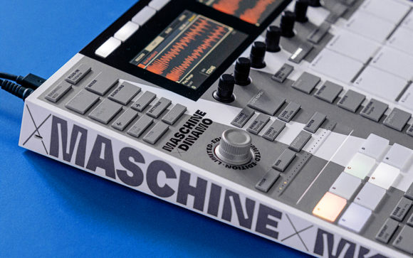
The phrase ‘type foundry’ harks back to a time when individual letters were cast in metal for hand typesetting or use in a printing press. One of the defining features of Whyte, the typeface Breyer and Schroth eventually settled on for the MASCHINE collaboration, also has an anachronistic edge to it – with a surprisingly modern benefit.
“Our field carries a big bag of historical references, but we as a digital foundry are interested in using modern technology as a means of finding new approaches,” explains Breyer. The typeface uses the idea of ink traps – little engravings in the inside corners of letters that mitigate ‘bleed’ issues with early printing technology; they collect ink in such a way that characters remain readable when printed in small sizes. “Today, with high-res screens and modern printing, you don’t need ink traps – everything is super sharp. So we wanted to look again at ink traps through the lens of modern technology.”
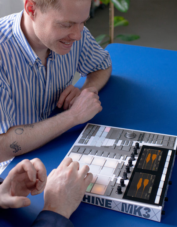
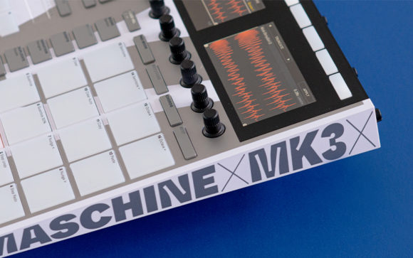
Dinamo produces what are known as variable fonts. They don’t arrive as a fixed number of different weights and styles, but rather as a design space that allows various parameters to be modulated via the included software (something that ought to sound familiar to music producers) – this process then outputs the familiar static files that can then be used elsewhere. Designers can, for example, morph between having no ink traps at all and having huge ink traps that dominate the look of the glyphs at any size. And on close inspection, it’s clear that this adaptability is put to good use on the MASCHINE DINAMO – from the huge, squared-off M shape that sandwiches the the hardware, to the ‘ticker tape’ running around its edge and the tiny labels on each button and pad. There are even a few special glyphs that highlight some of the hidden gems in the extensive character set. The Korean brackets on the Swing and Tempo buttons are a good example, and even MASCHINE’s standard left and right arrows have been replaced with distinctively ink-trapped equivalents.
“What I find so interesting,” Schroth says, “is that something that was designed to minimize ink bleed in a traditional printing press can also help minimize light bleed in a modern application. The function labels on Maschine’s buttons are lasered in, and the backlight shines through to make them readable. The ink traps actually serve to make those labels appear better defined than they otherwise would.”
“But you know what? It also reminds me of graffiti bubbles. Those characters often have intense cuts in them – especially with the white, silver, and black. That’s also a little bit of a reference to classic hip hop–inspired products, like the JVC Boomblasters and Casio G-Shocks.”
Breyer recounts: “I think in the very beginning Fabian and I made a design proposal with like 100 colors, actually, but then we thought of doing something more subtle, but stronger and more decisive.”
In keeping with that theme, Breyer was insistent that the design ought not to add anything extraneous, and rather “celebrate the object itself by labelling it.”
“I think, often, in these kinds of collaborations you see people adding adjectives and so on – ‘made in Berlin’ or whatever. We’re obviously not on board with any of that, we just wanted to call it what it is.”

“For the other colors, we started out by thinking about what was possible with the material,” he continues. “I think it’s amazing that it’s silk-screened – there are certainly cheaper options. We thought about a white-rabbit kind of color scheme which led to the silver. We experimented with mixing colors, and here we have a certain percentage of gold in it too. It’s subtle, but in the right light, you can see it shimmering through.”
Lighting was also very much on Schroth’s mind throughout the process of creating the limited-edition hardware. The white plastic used, he explains, actually has a degree of translucency such that MASCHINE’s corners and edges are subtly highlighted in bright ambient light.
“You can see light entering the material,” he explains. “But the silver paint has a metal component that completely blocks off the light. That paint actually throws a little shadow into the material if you look closely enough. So there’s some magic going on there – it almost has an aura.”
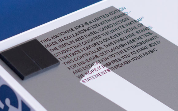
“The object itself is a wonderful, bold statement,” he concludes, echoing the message printed on the baseplate of the hardware. “And I think, in the right hands, it has the potential to become a beautiful, powerful tool for creating even bolder musical statements.”
Photos: Kasia Zacharko
Related articles
-
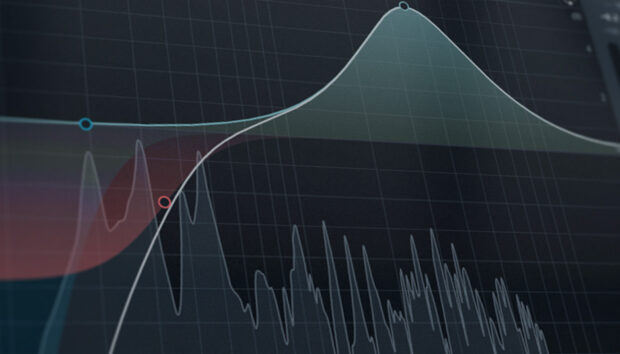
How to add definition to your tracks with effects
Learn how to improve track definition using simple techniques and audio effects available in the NI 360 Essentials subscription.
-
How to make music: the beginner’s guide
Learning how to make music is easier than you think. This beginner's guide covers everything from understanding music theory and…
-
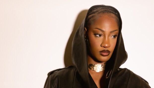
Tems and Native Instruments join forces to empower women in music across Africa
Discover how GRAMMY-winner Tems and Native Instruments are partnering with the Leading Vibe Initiative to empower emerging women in music…
-

Why Monark plays a central role in Broken Hill’s Detroit-influenced club tracks
Broken Hill breaks down how he used Monark to shape the bass line on "Brain Delay" – sharing tips on…
-
How the Kontrol S88 keyboard helps Kaitlyn Aurelia Smith translate emotion into structure
Kaitlyn Aurelia Smith shares how the Kontrol S88 keyboard and Kontakt shaped the writing of GUSH, focusing on harmony, emotion,…
-
How Sainte Vie uses Battery to shape rhythm across cultural sounds
Sainte Vie breaks down how he uses Battery to trim, tune, and shape rhythm across genres - keeping his drum…
-
What is phonk music? A beginner’s guide and how to produce it
Learn what phonk music is, what defines its gritty sound, and follow this step-by-step guide on how to make phonk…
-
Why Ainonow uses FM8 for percussion, noise, and everything that isn’t a lead
Ainonow shares how he uses FM8 for percussion and noise design on his latest release, with tips on transient control,…